
Optimizing your website for mobile marketing is crucial in today’s digital landscape. With over half of all internet traffic coming from mobile devices, neglecting to cater to this audience can be detrimental to your business. A poorly optimized mobile website can lead to high bounce rates, loss of potential customers, and a negative impact on your search engine rankings. To ensure you are making the most of mobile marketing opportunities, it is necessary to optimize your website effectively for mobile users.
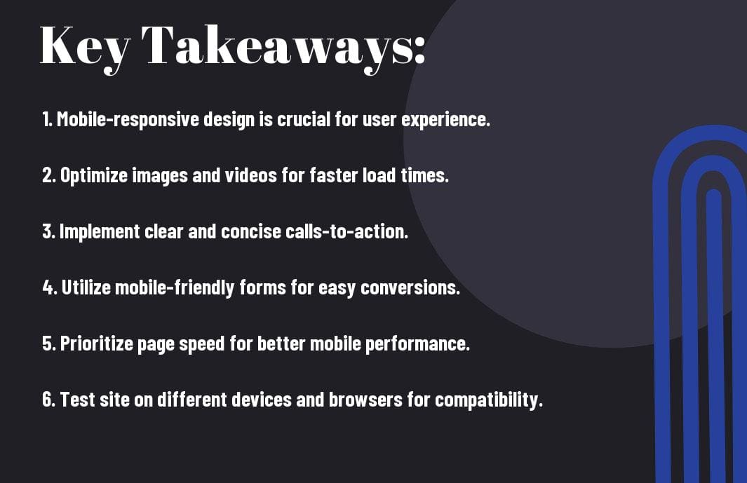
Key Takeaways:
- Responsive design: Ensure your website is optimized for mobile devices with a responsive design that adapts to different screen sizes.
- Mobile-friendly content: Create content that is easy to read and navigate on mobile devices to provide a positive user experience.
- Page speed: Improve the loading speed of your website on mobile devices to reduce bounce rates and improve SEO rankings.
Understanding Mobile Users
Mobile User Behavior and Expectations
For businesses looking to optimize their website for mobile marketing, it is crucial to understand the behavior and expectations of mobile users. Mobile users are often on-the-go and have limited time and patience. This means that they expect websites to load quickly and be easy to navigate on their mobile devices. They are typically looking for quick access to information or a seamless shopping experience.
Differences Between Desktop and Mobile Experiences
Users experience websites differently on desktops compared to mobile devices. On mobile, screen sizes are smaller, and interactions are touch-based, which can impact the design and functionality of a website. This means that websites need to be optimized for mobile with responsive design and mobile-friendly features to provide a seamless user experience. Mobile users are also more likely to use voice search and expect localized information based on their current location.
To effectively engage mobile users, businesses must adapt their website design and content to suit the unique needs and preferences of mobile users. Understanding the differences between desktop and mobile experiences is key to creating a successful mobile marketing strategy that caters to the growing number of mobile users. By optimizing for mobile, businesses can reach a wider audience and drive more conversions in today’s mobile-driven marketplace.
Designing for Mobile
Once again, the importance of designing for mobile cannot be emphasized enough in today’s digital landscape. With the majority of internet users accessing websites on their mobile devices, optimizing your website for mobile marketing is crucial for the success of your business.
Responsive Web Design Principles
Principles of responsive web design involve creating a website that automatically adjusts to the screen size of the device it is being viewed on. This ensures that your website looks and functions seamlessly on any device, whether it’s a smartphone, tablet, or desktop computer. By incorporating fluid grids, flexible images, and media queries, you can provide a consistent user experience across all devices.
Simplifying Navigation for Smaller Screens
For smaller screens, it is necessary to simplify the navigation of your website to make it easier for users to find what they are looking for. Consider using a hamburger menu, collapsible navigation tabs, or a sticky navigation bar to streamline the user experience on mobile devices.
Responsive design ensures that your website is user-friendly and intuitive on all devices, which is crucial for keeping visitors engaged and encouraging them to explore more of your content. By simplifying navigation for smaller screens, you can increase user satisfaction and ultimately drive conversions.
Optimizing Visual Elements for Mobile
Optimizing visual elements for mobile involves ensuring that images, videos, and other visual content are optimized for quick loading times and optimal display on smaller screens. This includes using responsive images, lazy loading techniques, and optimizing file sizes to deliver a seamless visual experience on mobile devices.
Visual elements play a critical role in capturing the attention of mobile users, so it is necessary to prioritize visual optimization for mobile marketing success. By paying attention to the details of your visual elements, you can enhance the overall user experience and leave a lasting impression on your audience.
Site Performance on Mobile
Your Why Do You Need to Optimize Your Website for Mobile? website’s performance on mobile devices is crucial for a successful mobile marketing strategy. With more and more users accessing websites through their smartphones and tablets, optimizing your site for mobile is no longer just an option, but a necessity. This chapter will research into the importance of site performance on mobile, techniques to increase site speed, and tools for monitoring mobile site performance.
Importance of Page Load Speed
Mobile users expect fast and efficient loading times when accessing websites on their devices. Slow loading pages can result in a high bounce rate, impacting your site’s visibility and conversion rates. Google also considers page load speed as a ranking factor for mobile search results, making it necessary for your website to load quickly on mobile devices.
Techniques to Increase Mobile Site Speed
To optimize your website for mobile speed, consider implementing techniques such as optimizing images, minifying CSS and JavaScript files, leveraging browser caching, and using a content delivery network (CDN). These strategies can help reduce load times and improve the overall performance of your site on mobile devices.
For instance, compressing images before uploading them to your site can significantly reduce file sizes and improve loading times. Additionally, eliminating unnecessary elements and scripts that can slow down your site’s performance is crucial for a seamless mobile user experience.
Tools for Monitoring Mobile Site Performance
For effective monitoring of your mobile site’s performance, consider using tools like Google PageSpeed Insights, GTmetrix, Pingdom, and WebPageTest. These tools provide valuable insights into your site’s speed, performance metrics, and suggestions for improvement.
Plus, regularly monitoring and analyzing your site’s performance on mobile devices can help you identify areas for improvement and ensure that your website is delivering a seamless user experience across all devices.
Creating Mobile-Friendly Content
Tailoring Content to Mobile Users
Many website visitors today access sites on their smartphones or tablets, making it crucial for businesses to tailor their content to suit mobile users. When creating content for your website, consider the screen size and functionality of mobile devices. Keep paragraphs concise and engaging to cater to users who are often on-the-go and have limited attention spans. Use bullet points, subheadings, and short sentences to make information easily digestible on smaller screens.
The Role of Visual Content in Mobile Marketing
Visual content plays a crucial role in mobile marketing as it can quickly capture a user’s attention and convey information more effectively than text alone. Incorporate eye-catching images, videos, and infographics that are optimized for mobile viewing. Visual content not only enhances the user experience but also helps in conveying your brand personality and key messages efficiently.
Creating compelling visual content that is relevant and engaging will encourage users to explore further and engage with your website. Whether it’s through product images, animations, or interactive elements, ensure your visual content is mobile-responsive and enhances rather than hinders the overall user experience.
Ensuring Content Readability on Mobile Devices
Ensuring content readability on mobile devices is important for keeping users engaged and preventing them from bouncing off your site. Choose legible fonts, appropriate font sizes, and ample spacing to enhance readability on smaller screens. Test your content across various devices to ensure it displays correctly and is easy to read.
Optimizing your content for mobile devices will not only improve user experience but also positively impact your site’s performance and search engine rankings. By creating mobile-friendly content that is visually appealing and easy to read, you can effectively connect with your mobile audience and drive engagement on your website. Note, mobile optimization is no longer an option but a necessity in today’s digital landscape.
Mobile SEO Strategies
Nowadays, optimizing your website for mobile devices is crucial for your digital marketing strategy. Mobile SEO involves a variety of techniques and strategies to ensure your website ranks well in mobile search results. Let’s explore into some key strategies for mobile SEO.
Mobile-First Indexing by Search Engines
Search engines now prioritize the mobile version of websites for indexing and ranking. This means that if your site is not optimized for mobile, it may not perform well in search results. To improve your mobile SEO, ensure your website is responsive, loads quickly, and provides a seamless user experience across all devices.
Keyword Strategies for the Mobile Audience
Strategies to target the right keywords are important for mobile SEO success. Mobile users often use different search terms than desktop users, so it’s crucial to understand the intent behind mobile searches. Long-tail keywords, local keywords, and conversational phrases are key to optimizing for mobile audiences.
Mobile keyword strategies should focus on user intent and context. Utilize tools like Google’s Keyword Planner and incorporate relevant keywords naturally within your content to attract mobile users effectively.
Local SEO and Its Impact on Mobile Traffic
Mobile
Engines
Leveraging Mobile Features for Marketing
Integrating with Mobile Hardware Capabilities
Capabilities Despite the widespread use of smartphones and their advanced capabilities, many businesses fail to fully leverage the potential of mobile hardware for marketing purposes. Mobile devices come equipped with a range of features such as GPS, cameras, accelerometers, and touchscreens that can be utilized to create unique and engaging marketing experiences for users.
Integrating with mobile hardware capabilities allows businesses to deliver personalized and location-based content, offer interactive experiences, and even enable augmented reality features to enhance customer engagement.
Using Mobile-Only Features to Enhance Engagement
Any business serious about mobile marketing must consider incorporating mobile-only features to stand out in a crowded digital landscape. From push notifications and in-app messaging to mobile wallets and AR/VR experiences, there are a myriad of tools and technologies that can be harnessed to drive user engagement and loyalty.
Engagement By leveraging mobile-only features, businesses can create targeted and personalized interactions with their audience, leading to higher conversion rates and customer satisfaction. These unique features not only enhance engagement but also set businesses apart from competitors who may not be as quick to adapt to the rapidly evolving mobile marketing landscape.
Measuring and Analyzing Mobile Web Optimization
Unlike other forms of marketing, mobile marketing requires a specific approach to ensure success. As highlighted in 4 Reasons to Optimize your Site for Mobile Devices, optimizing your website for mobile devices is crucial for reaching a wider audience and driving conversions. To measure the effectiveness of your mobile web optimization efforts, it’s imperative to focus on key performance indicators (KPIs) that are specific to mobile marketing.
Key Performance Indicators for Mobile Marketing
Mobile KPIs can include metrics such as mobile traffic, bounce rates, conversion rates, and average session duration. By tracking these KPIs, you can understand how users are interacting with your site on mobile devices and identify areas for improvement. Additionally, monitoring mobile-specific metrics like app downloads and in-app purchases can provide valuable insights into user behavior and preferences on mobile platforms.
Utilizing Analytics to Improve Mobile User Experience
Analyzing data collected from mobile analytics tools is crucial for enhancing the overall user experience on mobile devices. By examining user behavior, navigation patterns, and page load times, you can identify friction points and optimize your mobile website accordingly. Utilizing analytics tools like Google Analytics or Mixpanel can help you gain a deeper understanding of how users engage with your site on mobile, allowing you to make data-driven decisions to enhance their experience.
Marketing
Adapting Strategies Based on Data Insights
Mobile marketing strategies should be adaptive and flexible based on the insights gathered from analytics. By reviewing data on a regular basis, you can identify trends, preferences, and user needs that will allow you to tailor your marketing strategies effectively. Whether it’s adjusting your content strategy, refining your mobile advertising campaigns, or optimizing the user journey, leveraging data insights can help you stay ahead in the competitive mobile landscape.
Plus
Moreover, it’s crucial to conduct A/B testing to experiment with different approaches and determine what resonates best with your mobile audience. By continuously refining your strategies based on data insights, you can optimize your mobile marketing efforts for better engagement, conversions, and overall success.
Final Words
With this in mind, optimizing your website effectively for mobile marketing is crucial in today’s digital landscape. As more and more consumers rely on their mobile devices to access information and make purchases, having a mobile-friendly website is imperative for reaching your target audience and driving conversions. By following best practices such as responsive design, fast loading times, and user-friendly navigation, you can create a seamless mobile experience that keeps visitors engaged and ultimately leads to more sales.
FAQ
Q: Why is optimizing a website for mobile marketing important?
A: Optimizing a website for mobile marketing is crucial because a large percentage of internet users access websites through mobile devices. Failure to optimize can result in a poor user experience and lower conversion rates.
Q: What are some key elements to consider when optimizing a website for mobile marketing?
A: Key elements to consider include responsive design, fast loading times, simplified navigation, mobile-friendly content, and clear call-to-action buttons.
Q: How does a responsive design contribute to effective mobile optimization?
A: Responsive design ensures that a website adapts to different screen sizes and devices, providing a consistent user experience across desktops, tablets, and smartphones.
Q: How can fast loading times impact mobile marketing optimization?
A: Fast loading times are crucial for mobile users who have limited patience. Slow loading times can lead to high bounce rates and decreased user engagement.
Q: What strategies can be implemented to optimize content for mobile marketing?
A: Strategies include using concise and scannable content, optimizing images and videos for mobile viewing, and prioritizing important information for quick access.
Q: How important is streamlined navigation for effective mobile marketing optimization?
A: Streamlined navigation is vital for mobile users to easily find what they are looking for on a website. Confusing navigation can lead to frustration and abandonment of the site.
Q: Why are clear call-to-action buttons crucial for mobile marketing optimization?
A: Clear call-to-action buttons guide mobile users on what actions to take next, such as making a purchase or signing up for a newsletter. They help streamline the user journey and improve conversion rates.
